
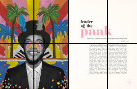
This grid is interesting as it is hard to spot and embraces the asymmetrical feel of the Swiss design form the 1940′-50s. I like how the middle 3 grids are taken up by the main focal point in the image and by two paragraphs. I also like how the top and bottom pictures on the left hand side both take up 4 sections in the grid. it gives the page less of a chaotic look.

The girds in these pages are not easy to follow as it was hard to find the grid. Im not a fan of how this was designed. It feels very messy and I feel it could of been better if just straightened some things up to fit the grid better.
I like how on this page each piece of text has its own section in the grid. I also like how the middle text is broken into two sections which mirrors the picture above it having each person In a section of the grid. I have learnt that grids help make a magazine page look more appealing and that when making a book or magazine you should definitely use grids to your advantage.
I like how this grid is not complicated and has a simple design. I like how there is something different in each section.
