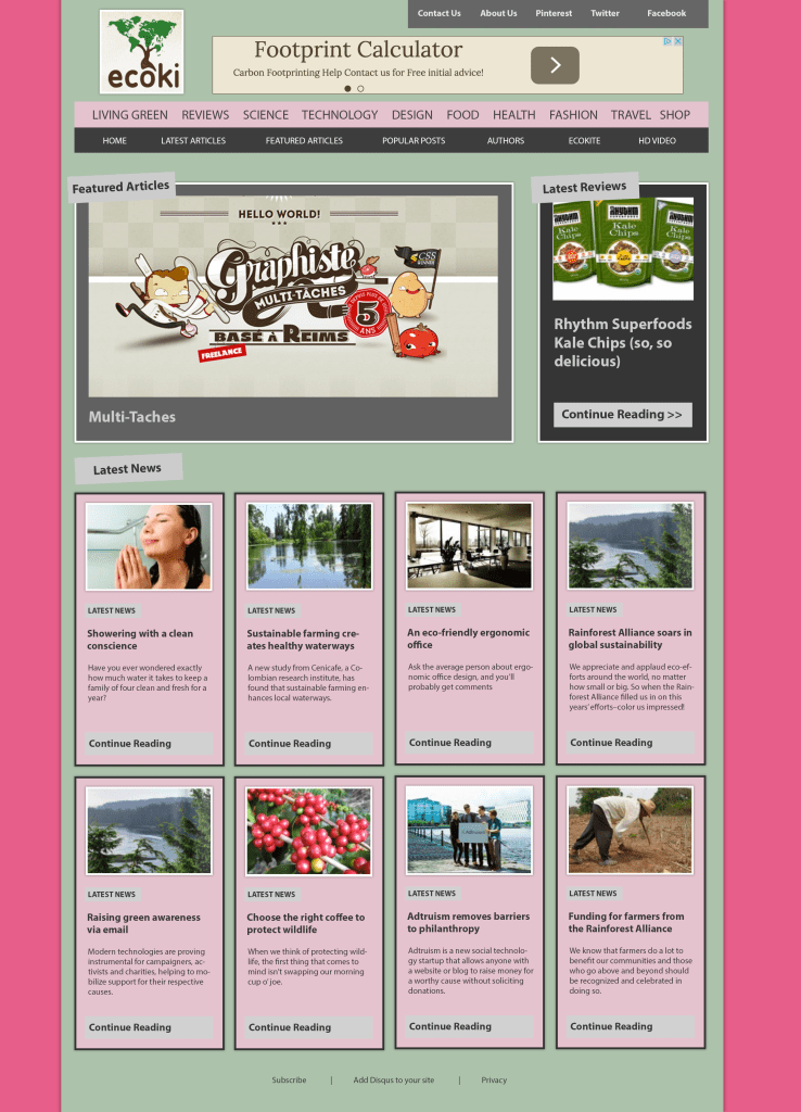
For this design, I looked at a colour wheel and found that pink and this shade of green were opposite colours not normally being paired together. Knowing that opposite colours are complementing colours I wanted to use them in a design to make the articles stand out, by using pink which is the boldest colour out of the two it pulls both colours together creating a complexion for the design. Using a light green made the articles pop out a bit more as well as using an intense pink for the background it draws attention to the centre, which is what I wanted to achieve giving the article a quirky finish.

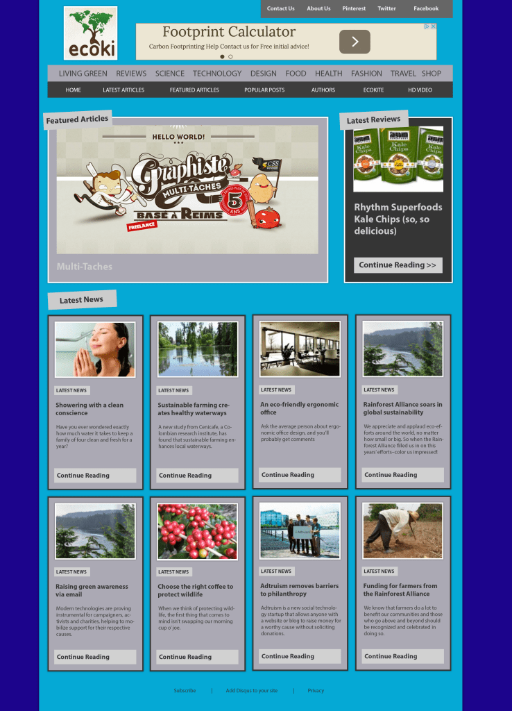
For this one I wanted to use a mono colour scheme commonly known as a foundational colour which is taken from a single base and extended using its own shades, tones and tints. I like the look of mono coloured scheme because I wanted to start off dark in the background and get lighter towards the middle to draw your eyes to the article. I wanted this to be mono coloured as its easy on the eye and not to harsh. An advantage of using a mono scheme on this design is because of the different shades of blue it gives a welcoming finish due to the variation of colour and gives an aesthetic finish.

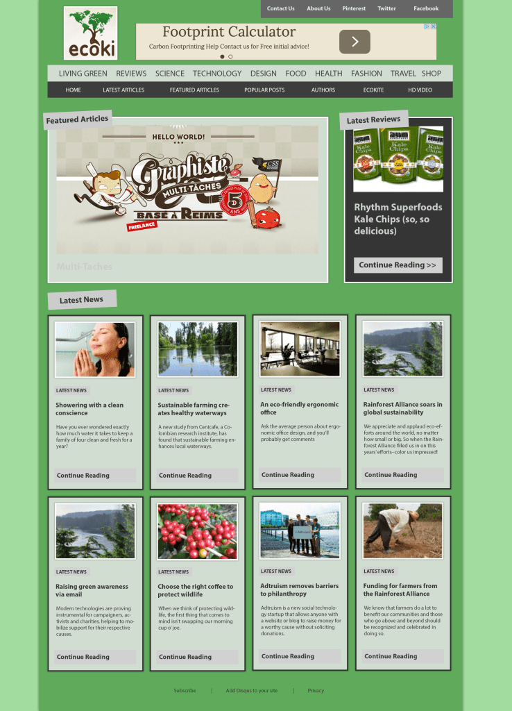
Despite using the mono coloured design, I felt that blue wasn’t the right colour for the website because, I felt like green would match the logo a bit better and overall give a more welcoming feel as well as a professional standard as dark colour can come across as not inviting. One limitation of using a mono coloured design is it be confining because the colour scheme can be seen as a poor fit and can be quite muted. I did not want to recreate the idea of having the outside dark and then gradually getting lighter towards the centre because I didn’t feel like the articles stood out as much as the first colour scheme that is why I made the most vibrant colour be the background which makes the inner column pop out more. I did the same with the articles to make them stand out and look more appealing.

Looking at a lot of websites, I felt a mono colour scheme that uses black and white worked well because I wanted to create a professional finish as black and white is a common pair. I wanted to recreate this look because I feel it looks very modern and warming. I wanted the middle column to stand out, so I made the background white. I then started by making minor adjustment to the articles. I found that light grey adds a quality finish to the article, wrapping in all the colours to bring together a neutral feel.