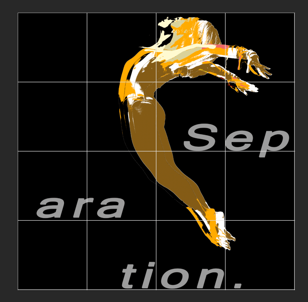
This is my final task, I choose this picture to update as I felt that this image had the most potential. I changed the colour to a mono colour scheme as I like the look of mono colour schemes. As I looked into Emil Ruder and Swiss design I wanted to create something similar. The gridded image is shown below showing how I wanted each part that conveys something in a different section. I made the women off centre as I wanted to give it a asymmetrical design. The text follows the grid with each part of the word resting on the bottom of the grid. To do this I adjusted the leading of each part of the word to match with the grid. For the woman I felt that it would be good to drag the layers out so they don’t match up quite right to give the feeling of asymmetry. I learnt that negative space can play to your advantage so I wanted to leave the top left corner open. I really wanted the view to focus on the girl so I broke down the layers so it would catch your eye more. The black space in the top left corner also helps as that is one of the first places a person looks. As there is nothing there your eye natural follows along the page as you would be reading and leads to to see the girls face. I feel like it came out amazing as I have really learnt a lot about how to design.