The first thing that catches your eye on this page is the bottom right corner art. People tend to first look at faces if they can see one. I like the use of the picture going over the border as it really grabs the attention of the viewer.
The first thing you see when you look at this page the bold picture in the top right corner as its background makes it pop out of the page. The second thing you see is the 3 smaller pictures at the bottom as its they are the only image that has no background making it stand out.

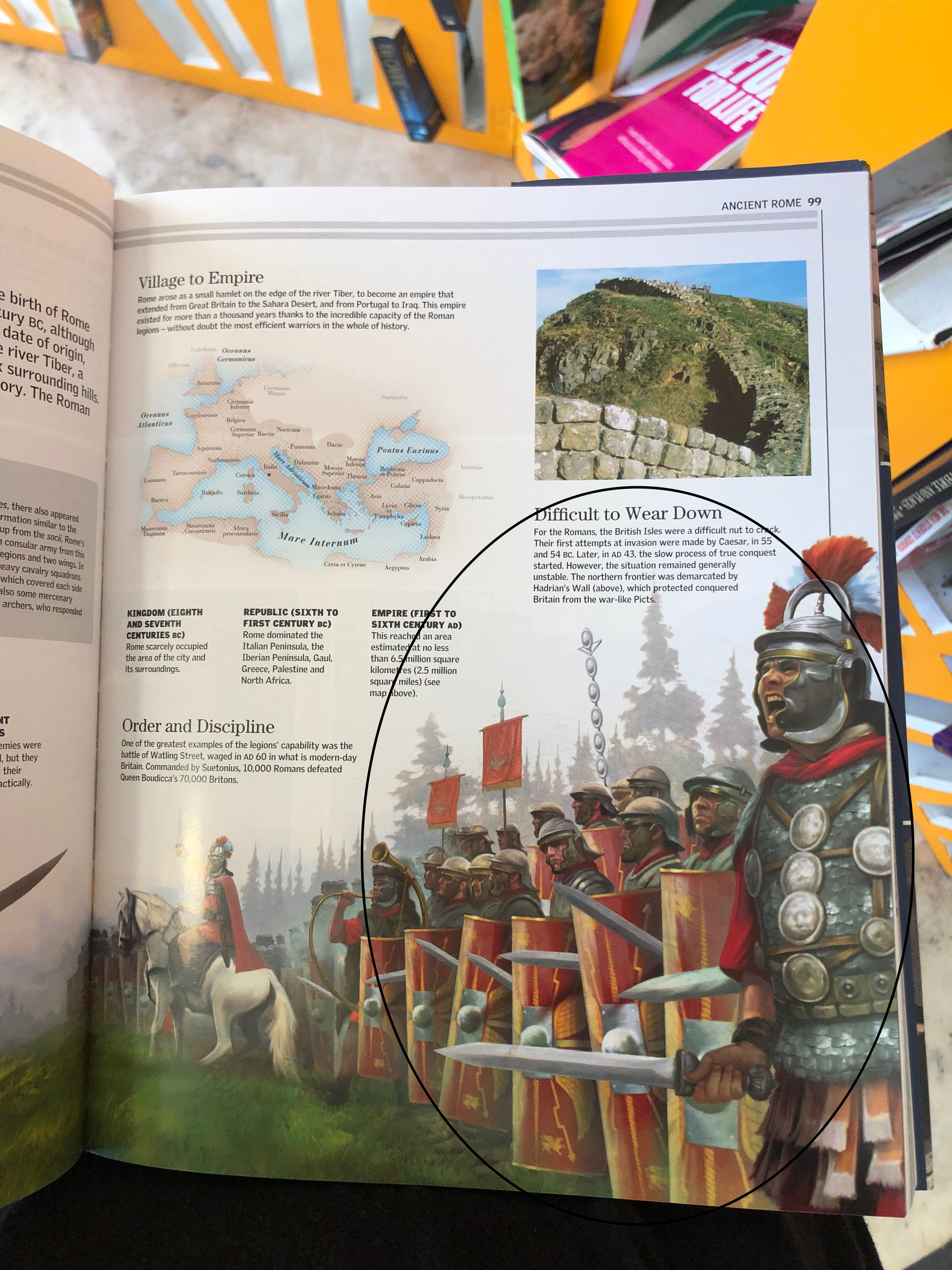
The first thing you see is the picture of the man on the left shouting as it takes up a lot of space and has a bold background. This draws your eye to it first as there is so much blank space around the picture. the second thing your eyes are drawn to is the thing he is shouting which is opposite him on the other page and your eye naturally follow the image. I like how this is done as it is incorporating images with text to guide the viewers eyes in a certain place. The third thing you see is the Big title in bold text as it colour pops out of the screen and its bold text really makes it hard to miss.
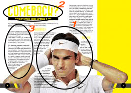
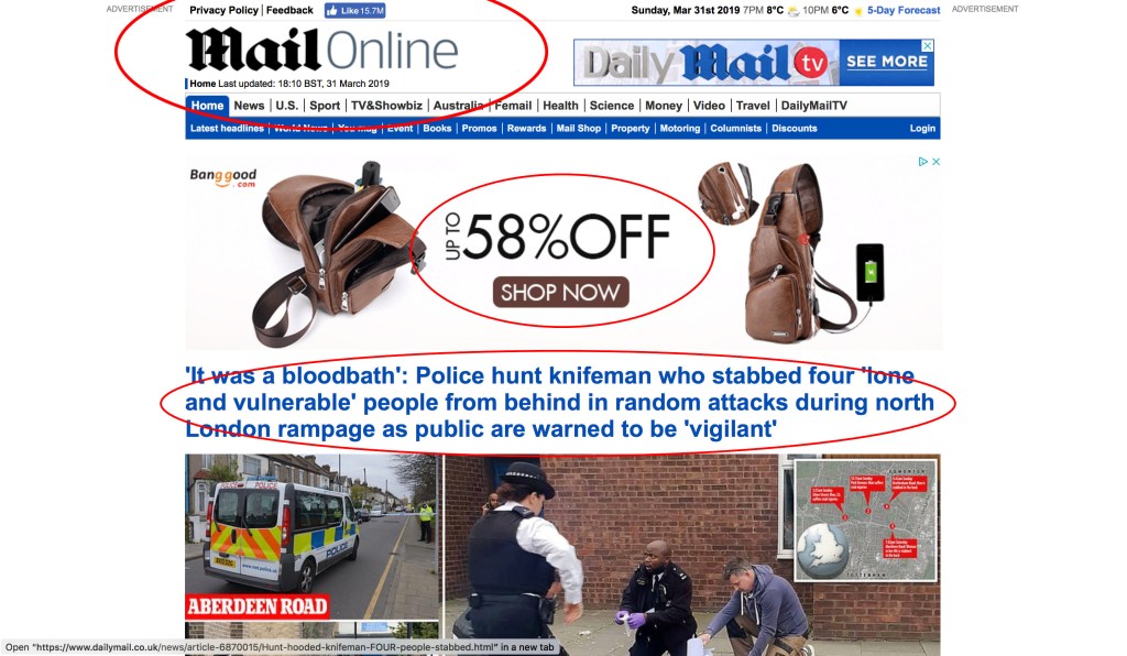
The first thing you se is the huge picture in the middle as it takes up so much of the pages. Its also right in the centre. The second thing you see is the Title in the top left corner as its bold and we normal looks up at the top left hand corner as we start reading from the top left. The third thing we see is the paragraph in between the picture and the title as we have seen both the picture and the title so we tend to have a look whats in the middle which is the writing.
